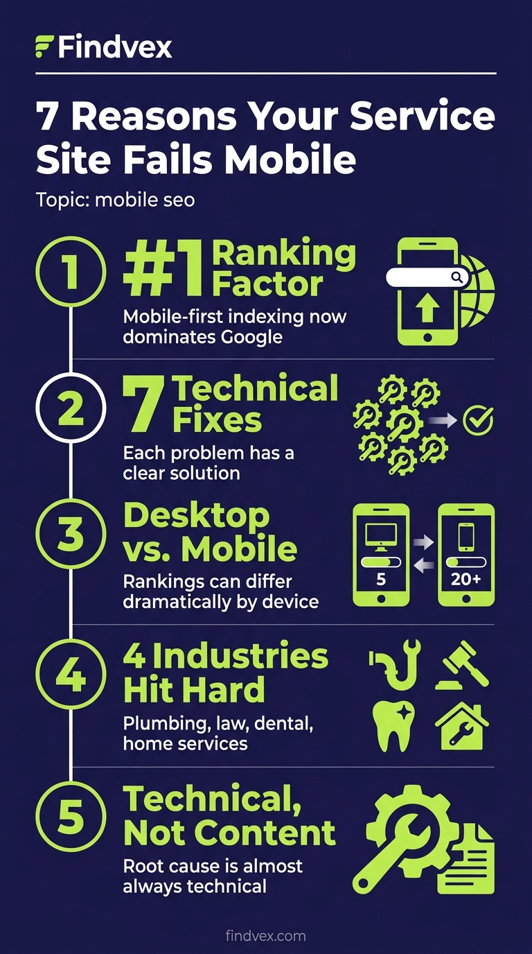
Mobile SEO for Service Businesses: 7 Technical Reasons Your Site Ranks Lower on Phones (and How to Fix Each One)
If your plumbing, law, dental, or home service website ranks well on desktop but falls off on phones, the cause is almost always technical — not content. This article breaks down the 7 most common mobile SEO problems specific to service business sites and gives you a clear diagnosis and fix sequence.
Quick answer
Service business websites rank lower on mobile when Google's mobile-first index encounters a slower, harder-to-crawl, or content-deficient mobile version of the site. The most common culprits are poor Core Web Vitals on mobile (especially LCP and INP), render-blocking resources, interstitials blocking content, tap targets too small for touch, and mobile-specific content differences that confuse the crawler. Fix the performance issues first, then audit for content parity between desktop and mobile.
Why Mobile Rankings Are a Separate Technical Problem
Most service business owners assume their site ranks the same everywhere. It doesn't. Since Google switched to mobile-first indexing, the mobile version of your site is the one Google uses to determine rankings — for everyone, including desktop users. If your mobile site is slower, thinner, or harder to crawl than your desktop version, your rankings suffer across the board.
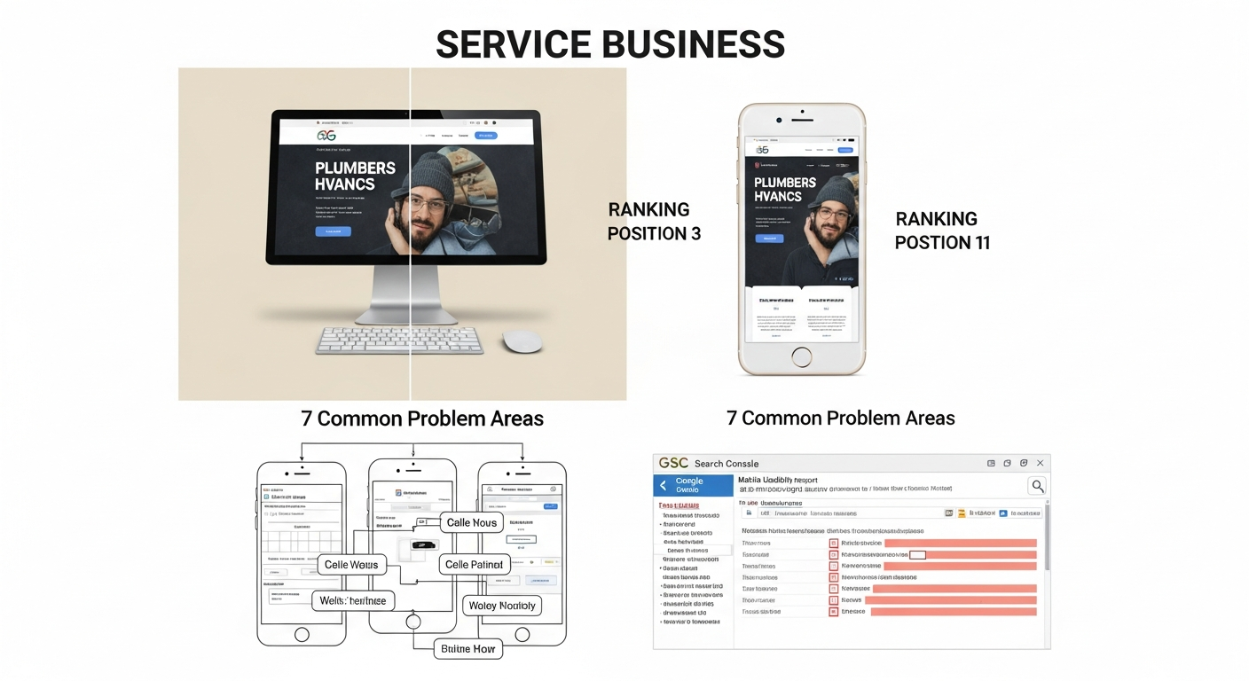
The gap shows up in a specific way: you check your rankings on a laptop and see position 4 or 5 for a key phrase. Then you search on your iPhone and find yourself on page 2. That delta is a diagnostic signal, not bad luck. Each cause has a specific fix, and most of them are findable in Google Search Console before you spend a dollar.
This article covers the 7 technical issues most likely to be causing that gap on service business sites — the kind of sites built on WordPress, Squarespace, or Wix for plumbers, dentists, law firms, HVAC companies, and similar local businesses. I'll give you symptoms, causes, fixes, risk levels, and what to hand off to a developer.
What Mobile-First Indexing Actually Means for Service Sites
Mobile-first indexing means Googlebot primarily uses the mobile version of your page to evaluate content, crawlability, and ranking signals. It does not mean Google has a separate mobile index — it means the mobile rendering is the canonical input to a single index.
For service businesses, this creates a specific risk: many of these sites were originally designed desktop-first, then made 'responsive' using a CSS theme. Responsive design is often enough — but not always. Problems arise when the mobile version hides content (via CSS display:none or JavaScript toggles), loads significantly slower, uses interstitials that cover content, or renders incorrectly on Googlebot's mobile user-agent.
The practical test: open your site on an actual Android device (Googlebot uses a Chrome-based Android crawler) and ask whether the page is usable, fast, and complete. If the answer is no on any count, you have a mobile SEO problem.
“AI agents do in hours what teams used to do in weeks. The advantage compounds.”
Mobile SEO Diagnosis Checklist
Run through this checklist before diving into individual fixes. It tells you where to focus first.
- [ ] Run a Google Search Console mobile usability report — are there listed errors?
- [ ] Open PageSpeed Insights (web.dev/measure) on mobile tab — is LCP above 2.5s or INP above 200ms?
- [ ] Use GSC's URL Inspection tool on a key page — does 'Crawled as' show Googlebot Smartphone?
- [ ] Check the rendered HTML in GSC URL Inspection — is critical content (phone number, service descriptions, CTAs) present in the rendered output?
- [ ] Test with Google's Mobile-Friendly Test tool — any viewport or tap target warnings?
- [ ] Compare desktop vs. mobile word count on key service pages using a browser resize or Chrome DevTools device emulator
- [ ] Check for interstitial pop-ups on mobile that wouldn't appear on desktop
- [ ] Verify structured data (LocalBusiness, Service) appears on mobile rendered version, not just desktop
Problem 1: Core Web Vitals Are Failing on Mobile — But Passing on Desktop
This is the most common cause of a mobile ranking gap and the one most business owners don't realize is split by device. Google measures Core Web Vitals separately for mobile and desktop using field data from Chrome users. A site can score 'Good' on desktop and 'Needs Improvement' or 'Poor' on mobile simultaneously.
For service business sites, the most common offenders are: a hero image that's oversized for mobile viewports driving a slow Largest Contentful Paint (LCP), third-party chat widgets or booking plugins that increase Interaction to Next Paint (INP) on slower devices, and layout shifts (CLS) caused by fonts or ads loading after initial render.
Symptom: Desktop Core Web Vitals pass in GSC, mobile fails. PageSpeed Insights mobile score is significantly lower than desktop score.
Fix sequence: Start with LCP. Identify the LCP element on mobile (PageSpeed Insights shows it). If it's an image, serve a properly sized WebP version for mobile using responsive image srcset or a CDN that auto-resizes. If it's a text block, check if a render-blocking font or CSS file is delaying it. INP issues almost always require developer involvement — they're usually caused by event listener bloat in third-party scripts.
Risk level: Medium. Image optimization is low-risk. Removing or delaying third-party scripts carries moderate risk if those scripts include booking functionality.
Problem 2: Mobile Version Is Hiding Content Google Uses for Ranking
Responsive themes sometimes hide content on mobile using CSS (display:none) or JavaScript-driven accordions and tabs. This is fine for user experience — but if the hidden content contains keywords, service descriptions, or internal links that appear on desktop, Google may index a thinner version of the page.
Google has stated it can crawl content inside accordions and expandable sections, but there's an important nuance: content that requires user interaction to reveal may receive less indexing weight than content visible on load. For service businesses, hiding your full service descriptions or location information in a mobile accordion is a ranking risk.
Symptom: Your desktop page clearly describes 'emergency AC repair in Phoenix' but the mobile version only shows a brief headline and a collapsed section. Your rankings for those specific terms are weaker on mobile searches.
Fix: Use Chrome DevTools → Device Mode (Cmd+Shift+M on Mac) to inspect what's actually rendered on mobile without JavaScript interaction. Compare headings, paragraph content, and internal links to desktop. If substantial content is hidden, either make it visible-on-load for mobile or accept the risk that it may not contribute fully to rankings.
Risk level: Low (audit). Medium (restructuring content layout requires developer/designer input).
GSC check: URL Inspection → View Tested Page → HTML tab. Search for specific phrases from your service descriptions. If they don't appear in the mobile HTML output, Google can't see them.
Problem 3: Intrusive Interstitials Are Triggering a Google Penalty
Google's intrusive interstitial penalty specifically targets mobile. Pop-ups that appear immediately on page load, cover the main content, or are difficult to dismiss can reduce rankings for that URL. This is a documented ranking signal, not a myth.
Service businesses frequently add interstitials for: email capture, promotional banners ('10% off this week'), cookie consent (required by law but must be styled correctly), and live chat widgets that expand to full-screen on mobile.
Symptom: A specific service page ranks notably lower on mobile than desktop. That page has a pop-up that appears within 2-3 seconds of load on mobile.
What's penalized: Pop-ups that cover the main content immediately on load; pop-ups that require dismissal before content is accessible; standalone interstitials that must be completed before reaching the page.
What's not penalized: Cookie consent notices (legally required); age verification gates; login walls for paywalled content; small, easily dismissable banners that don't cover main content.
Fix: Delay non-essential pop-ups by scroll trigger (after 50% scroll depth) rather than time trigger. Ensure the pop-up covers less than 30% of the viewport and has a clearly visible close button. Test with Google's Mobile-Friendly Test after changes.
Risk level: Low. Adjusting pop-up behavior is a CSS/JavaScript change with no SEO downside — only upside.
Problem 4: Small Tap Targets Are Signaling a Poor Mobile Experience
Google's mobile usability report flags tap targets that are too small or too close together. While this is primarily a UX signal, it feeds into Google's broader page experience assessment. For service businesses, the usual culprits are: small 'Call Now' or 'Book Appointment' buttons, navigation menu items packed too tightly, and footer links that are nearly impossible to tap on a phone screen.
Symptom: GSC Mobile Usability report shows 'Clickable elements too close together' or 'Touch elements too close'. The affected pages correlate with your lower-ranking mobile URLs.
Fix: Tap targets should be at least 48x48 CSS pixels with at least 8px of space between adjacent targets. In WordPress or page builder sites, increase button padding and line-height on navigation elements. Most themes expose these settings in the Customizer.
Developer handoff note: If the site uses a custom theme, the fix is to add min-height: 48px; min-width: 48px; padding: 8px to button and link elements in the mobile stylesheet (inside a @media (max-width: 768px) breakpoint). This is a 10-minute CSS change.
Risk level: Very low. Pure CSS styling change with no crawlability or content implications.
Problem 5: Render-Blocking Resources Are Delaying Mobile Page Load
On mobile connections — especially 4G or weaker — render-blocking JavaScript and CSS files have a disproportionate impact compared to desktop. When Googlebot crawls on its mobile user-agent, it encounters the same render-blocking behavior real users do. A file that adds 300ms of delay on a fast desktop broadband connection might add 1.5 seconds on a mobile simulation.
Common render-blocking sources on service business sites: Google Fonts loaded via @import in CSS (blocks the render thread), multiple analytics or tracking scripts loaded in the <head> without async/defer, WordPress plugins that enqueue scripts site-wide even on pages where they're not needed.
Symptom: PageSpeed Insights mobile shows 'Eliminate render-blocking resources' as a high-impact opportunity. The flagged resources are fonts, analytics scripts, or plugin CSS/JS files.
Fix: For Google Fonts, switch to the preconnect + display=swap loading pattern, or use a system font stack. For analytics and tracking scripts, ensure they use the async or defer attribute. For WordPress plugin bloat, a performance plugin like Asset CleanUp or Perfmatters can disable scripts on pages where they're not needed.
Developer handoff note: Adding async or defer to third-party script tags is a one-line change per script. However, test each change individually — some scripts break if deferred because they depend on synchronous loading order. Fonts should be switched to font-display: swap in the CSS.
Risk level: Medium. Deferring scripts that other scripts depend on can break functionality. Test on staging before deploying.
Problem 6: Missing or Incorrect Viewport Meta Tag
This is less common than it used to be, but it still appears on older service business websites, particularly those built on custom HTML templates or converted from older CMS platforms. Without the correct viewport meta tag, mobile browsers render the page at desktop width and scale it down, and Googlebot flags it as not mobile-friendly.
Symptom: Google's Mobile-Friendly Test returns 'Page is not mobile friendly — viewport not set'. GSC Mobile Usability shows 'Viewport not set' errors.
The correct tag: <meta name="viewport" content="width=device-width, initial-scale=1">
Common mistakes: Using content="width=980" (fixed width), using initial-scale=1, maximum-scale=1 (this disables pinch-to-zoom and is an accessibility violation), or placing the viewport tag after CSS files in the <head>.
Developer handoff note: The viewport meta tag must be in the <head> section, before any CSS link elements. It's a single-line HTML addition. If the site uses a CMS theme, check the theme's header.php or equivalent template file.
Risk level: Very low. Adding or correcting the viewport tag only improves mobile rendering.
Problem 7: Structured Data Not Rendering on Mobile
Service businesses rely on LocalBusiness, Service, and Review schema to trigger rich results — star ratings, address information, and service details that appear in search results. If this structured data is injected via JavaScript after page load, and Googlebot's mobile crawl doesn't fully execute that JavaScript, the schema may not be present in the mobile-indexed version of the page.
This doesn't directly cause a ranking drop in traditional results, but it can suppress rich results that improve click-through rate on mobile SERPs — which indirectly affects traffic.
Symptom: Google Search Console → Enhancements → LocalBusiness or Review schema shows errors or missing coverage on specific pages that you know have schema deployed.
Fix: Where possible, embed JSON-LD schema directly in the <head> or <body> of the HTML (server-rendered), not injected by a JavaScript framework after DOM load. If your schema plugin renders it server-side (Yoast SEO, Rank Math, Schema Pro all do this), you're likely fine. If you're using a custom JavaScript solution, verify with GSC's URL Inspection → View Tested Page → HTML tab that the schema JSON-LD block appears in the source.
Developer handoff note: JSON-LD in a static <script type="application/ld+json"> block in the <head> is the most reliable delivery method. Avoid schema in JavaScript template literals that require client-side rendering.
Risk level: Low (verification). Medium if restructuring how schema is delivered — test with the Rich Results Test before and after.
For a deeper look at which schema types matter most for service businesses, see our guide to schema markup for small business websites.
What to Check in Google Search Console for Mobile SEO
Google Search Console contains most of what you need to diagnose a mobile ranking gap. Here's the specific sequence:
- Core Web Vitals report (Experience → Core Web Vitals): Switch between Mobile and Desktop tabs. Any URLs in 'Poor' or 'Needs Improvement' on mobile that pass on desktop are your first priority.
- Mobile Usability report (Experience → Mobile Usability): Lists pages with specific mobile rendering errors — viewport not set, content wider than screen, clickable elements too close together, text too small to read.
- URL Inspection → Mobile Crawl: Enter a key service page URL. Under 'Coverage', confirm 'Crawled as: Googlebot Smartphone'. Under 'Page Resources', check if any critical CSS or JS files are blocked. Under 'View Tested Page → HTML', search for critical on-page content.
- Search results performance by device: Go to Performance → Search results → Devices. Compare average position for the same queries broken down by mobile vs. desktop. A consistent 3+ position gap across multiple queries confirms a site-wide mobile issue rather than a page-level one.
- Index Coverage → Mobile: If you see 'Submitted URL not selected as canonical' errors concentrated on mobile URLs, you may have a canonical mismatch between mobile and desktop versions.
The Right Order to Fix Mobile SEO Issues
Not every fix has equal impact. For service business sites with limited development resources, prioritize in this sequence:
Week 1 — No-code fixes: Run GSC Mobile Usability report. Fix any viewport meta tag issues. Adjust tap target sizing in theme settings. Delay or remove intrusive pop-ups.
Week 2 — Performance fixes: Address LCP on mobile. Compress and resize hero images. Switch Google Fonts to display:swap loading. Use PageSpeed Insights mobile tab to identify the top 2-3 opportunities — most tools show estimated time savings per fix.
Week 3-4 — Developer handoff: Resolve render-blocking scripts (async/defer). Verify structured data renders in mobile HTML. Check for content hidden on mobile that exists on desktop.
Ongoing: Monitor GSC Core Web Vitals monthly. Service business sites often regress after plugin updates or theme changes add new scripts.
Mobile SEO Considerations Specific to Service Businesses
Service businesses have a particular mobile SEO dynamic: a large share of their search traffic comes from users on mobile devices actively looking for immediate help — plumber near me, emergency HVAC repair, dentist open now. These queries are almost entirely mobile. Getting the technical baseline right has a direct revenue impact.
A few service-business-specific patterns to watch:
Click-to-call: Your phone number should be a tel: link (<a href="tel:+1XXXXXXXXXX">), not plain text. Google can render click-to-call directly in search results for mobile users if your LocalBusiness schema includes a telephone property and your page uses a proper tel: link.
Booking widgets: Third-party booking integrations (Calendly, Acuity, OpenTable equivalents for home services) often load slowly on mobile and can spike INP scores. Consider a direct contact form as a fallback that loads immediately.
Local landing pages: If you have city or neighborhood service pages, run the mobile usability check on those specifically — they're often lower-priority during site builds and inherit problems the main site has fixed. See our guide to local landing pages that rank without sounding generic for content considerations on those pages.
For a broader look at the technical foundations that affect all of this, the technical SEO audit checklist for small business websites covers mobile alongside crawlability, indexing, and site architecture in one framework.
The Relationship Between Mobile Core Web Vitals and Rankings
Core Web Vitals are a confirmed ranking signal in Google's Page Experience system. For service businesses competing in a local market, the difference between 'Good' and 'Needs Improvement' on mobile LCP can be meaningful — especially when competing against other small businesses in the same category who are also likely to have performance issues.
The three metrics to track on mobile specifically:
LCP (Largest Contentful Paint): Target under 2.5 seconds. On service sites, this is almost always the hero image or a large above-the-fold background image. Fix: compress to WebP, serve appropriately sized images for mobile viewports, use preload hints for the LCP image element.
INP (Interaction to Next Paint): Target under 200ms. On service sites, this is almost always caused by third-party scripts — live chat widgets, appointment booking scripts, or marketing pixels that fire on interaction. Fix: audit and defer non-critical scripts.
CLS (Cumulative Layout Shift): Target under 0.1. On service sites, this is usually caused by web fonts loading and swapping out placeholder fonts (causing text to jump), or ad banners/widgets loading in after initial paint. Fix: use font-display:swap and specify image dimensions in HTML.
Our more detailed guide on how to fix Core Web Vitals walks through the specific fix sequence for each metric if you need to go deeper than what's covered here.
FAQs
Does Google use my mobile site or desktop site to determine rankings?
Google uses the mobile version. Since mobile-first indexing became the default for all sites, Googlebot Smartphone crawls and renders the mobile version of your page to determine content, quality, and ranking signals. This applies to rankings for both mobile and desktop users.
My site is responsive — does that mean mobile SEO is fine?
Responsive design is necessary but not sufficient. A responsive site can still fail mobile SEO if it hides content on mobile via CSS or JavaScript, loads slowly on mobile connections, has tap targets too small to use, or triggers pop-ups that Google classifies as intrusive interstitials. Run the Google Mobile-Friendly Test and GSC Mobile Usability report even if your theme is technically responsive.
How do I check if Google is crawling the mobile version of my site?
In Google Search Console, go to URL Inspection, enter any page URL, and look for 'Crawled as' under the Coverage section. It should say 'Googlebot Smartphone'. If it says 'Googlebot Desktop', that page may not yet be on mobile-first indexing, or there's a configuration issue worth investigating.
Can a pop-up actually lower my Google rankings on mobile?
Yes. Google has a documented penalty specifically for intrusive interstitials on mobile. Pop-ups that cover the main content immediately on load, or that are difficult to dismiss, can reduce rankings for the affected page. Cookie consent notices and legally required age gates are exempt. The fix is to delay pop-ups to a scroll trigger and ensure they don't cover the primary content.
Why does my service page rank #4 on desktop but #12 on mobile?
A consistent rank gap between desktop and mobile almost always indicates a technical issue on the mobile version of that page. The most common causes are slower Core Web Vitals on mobile, content that's hidden or absent in the mobile rendering, or an intrusive element that degrades the mobile experience signal. Start with Google Search Console's Mobile Usability report and PageSpeed Insights mobile tab to identify the specific cause.
Do I need a separate mobile site (m.dot) for better mobile SEO?
No. Separate mobile sites (m.example.com) are a legacy approach that introduces complexity — you need rel=canonical and rel=alternate annotations to link desktop and mobile versions correctly. A well-configured responsive design is Google's recommended approach and eliminates the synchronization problems that come with maintaining two separate site versions.
How long does it take for mobile SEO fixes to affect rankings?
Technical fixes vary in speed of impact. Core Web Vitals improvements measured by field data (Chrome User Experience Report) typically take 28 days to reflect in GSC, since Google uses a 28-day rolling window. Crawlability and content fixes can take effect within days to a few weeks, depending on how frequently Google crawls your site. Pop-up penalty reversals are typically seen within 1-2 crawl cycles after removal.
Related reading
Research notes
Background claims used while researching this article. Verify with the cited authorities before quoting.
- Google's intrusive interstitials penalty on mobile is a documented ranking signal — verify via Link to Google Search Central documentation on intrusive interstitials policy for verification and citation
- Core Web Vitals are a confirmed ranking signal in Google's Page Experience system — verify via Link to Google Search Central Page Experience documentation confirming CWV as ranking signal
- Google uses 28-day rolling window for Core Web Vitals field data — verify via Link to Google Search Console Help documentation on CWV reporting window for verification
Marcus Chen
Head of Technical SEO · Findvex
Marcus Chen heads technical SEO at Findvex. He writes about Core Web Vitals, indexing, schema, and JavaScript SEO — translating Google’s documentation into checklists small business owners can actually act on.
Expertise: Core Web Vitals · Indexing & crawlability · Schema / structured data · JavaScript SEO
Related reads
Answer Engine Optimization (AEO): The 2026 Guide for Small Businesses
Learn answer engine optimization (AEO) in 2026. This practical guide helps small businesses get found in AI search, voice assistants, and answer engines.
SEOGenerative Engine Optimization (GEO): The 2026 Guide for Small Businesses
Learn how generative engine optimization helps small businesses get found in AI search. Our 2026 GEO guide covers strategies, tactics, and tips to boost visibility.
SEOSEO Agency in USA: AI-Powered SEO for Small Businesses | Findvex
Findvex is a leading SEO agency in USA delivering AI-powered SEO strategies that help small businesses rank higher, drive traffic, and grow revenue. Get started today.