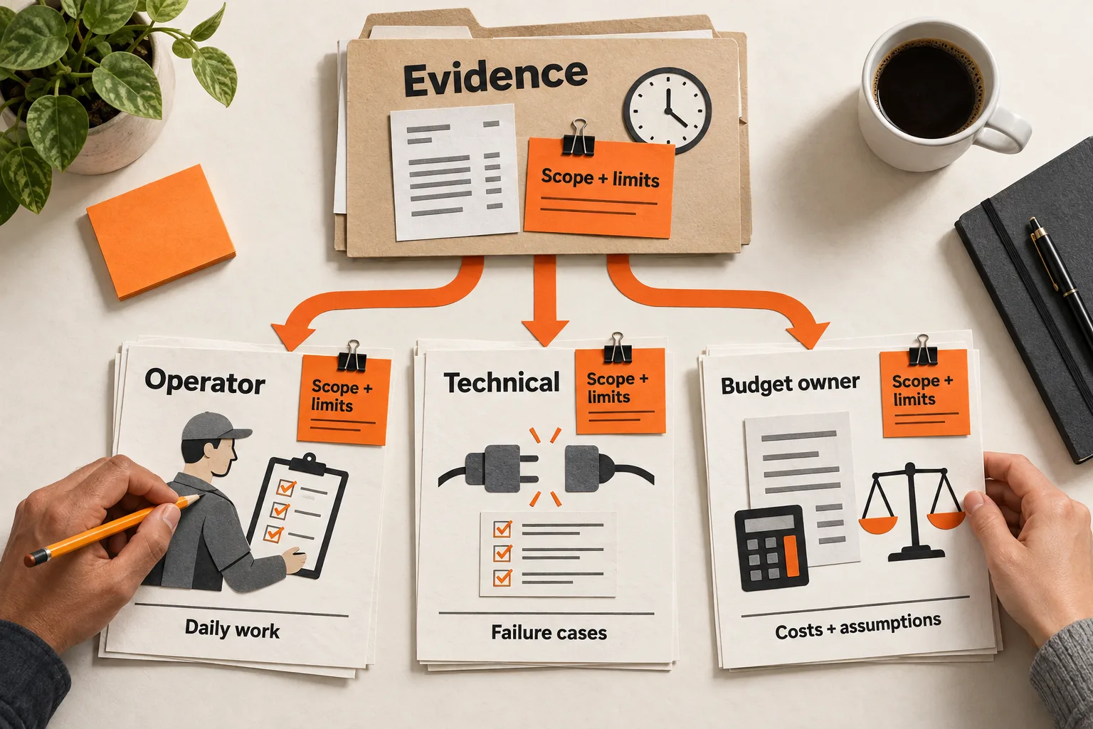
Before approving a SaaS website redesign, identify one decision visitors struggle to make and the evidence behind it. Watch likely customers attempt a realistic task, check which questions the page leaves unanswered, and inspect the corresponding funnel steps. Use the findings to choose a specific correction and a way to test it.
For example, visitors who hesitate on a pricing page may need help choosing a plan, estimating usage charges, or understanding setup requirements. Each calls for a different fix. This SaaS website conversion research workflow gives a small team a prioritized list of obstacles to bring to the redesign discussion.
Choose one visitor decision to investigate
Start with a sentence that defines the audience, task, and next action:
We want support managers at small software companies to determine whether our product fits their workflow and, if it does, create a trial account.
Keep the investigation within that boundary. Existing customers looking for documentation and enterprise buyers arranging procurement reviews have different tasks.
Pick one route through the site, such as a use-case page leading to trial signup. Choose a primary outcome you can verify: a successfully created account or a confirmed demo request. Treat a button click as an intermediate action.
Record the starting page, traffic source, device category, date range, and current page version. You will need that context when considering whether a change in results reflects the page or the people visiting it.
Choose a downstream quality check, too. For a trial, that might be completing the first useful product task. For a demo, it might be a request from an organization that meets your stated customer criteria. More form submissions alone may not justify a change.
Map the questions buyers need answered
Create a short question map for the chosen route. For an AI support product, it could look like this:
| Page | Buyer question | Evidence to inspect |
|---|---|---|
| Use-case page | Does this handle my workflow? | Relevant example and limitations |
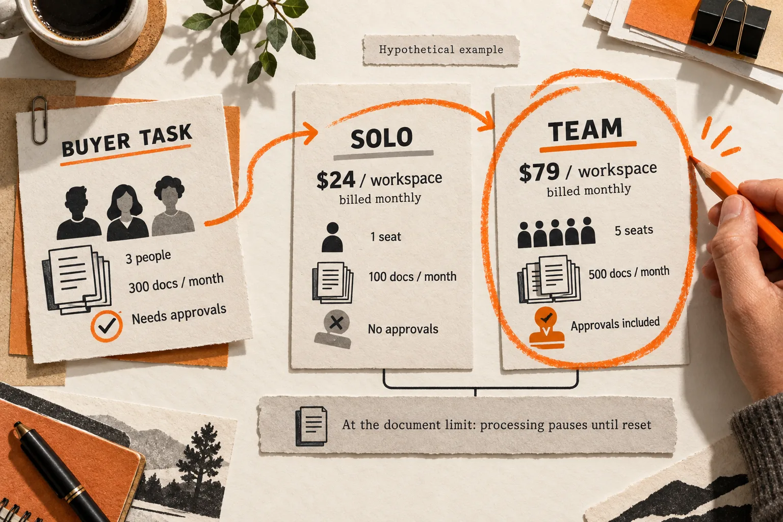
| Pricing page | Which plan covers my usage? | Billing unit and worked calculation |
| Signup page | What will setup require? | Permissions and setup steps |
| Data policy page | What happens to uploaded data? | Specific, current policy details |
Treat these as initial hypotheses. Compare them with questions from relevant prospects, support conversations, and lost opportunities you are authorized to review.
Keep exact customer wording separate from your interpretation. A question about whether an integration needs administrator approval should not automatically become a request for a shorter signup form. Check the actual permission requirements first.
FindVex’s pain-point evidence sheet guide can help you organize those observations. Public discussions can suggest questions to investigate, but they do not establish how common those questions are among your visitors.
Mark each page answer as absent, hard to find, unclear, or clear. If the product cannot meet a requirement, record a product-fit issue before assigning a copy change.
Watch likely customers attempt realistic tasks
Recruit people who resemble the audience in your decision statement. Familiar customers can explain their original concerns, but they already know things a new visitor must discover. Keep their observations separate.
For a manageable first round, schedule four to six sessions. This is a planning suggestion; it does not provide a representative sample or guarantee that you will uncover every problem.
Give participants a goal with enough context to make a decision. For example:
Your support team wants to evaluate this product using last month’s ticket volume. Decide whether there is a suitable plan and show what you would do next.
Provide the usage information needed for the task without naming the plan or navigation path you expect them to choose. An instruction such as “open Pricing and select the Growth plan” supplies the answer you intended to test. Nielsen Norman Group recommends realistic tasks that encourage action without revealing how to use the interface. Guidance on task scenarios
Ask participants to explain their thoughts as they work, then mostly watch and listen. When someone stops, ask what they expected to find or what they still need to know. GOV.UK’s guidance similarly recommends observing actual or likely users completing believable tasks with neutral instructions. Moderated usability testing guide
Record the attempted task, page, observable action, unresolved question, and outcome. Note whether the person completed it independently, needed help, or stopped. If you intervene, mark where.
Keep observation separate from explanation. Repeatedly opening a pricing tooltip is observable; distrust of the company is an interpretation that needs more evidence. Ask permission before recording, and use dummy information when sensitive customer data is unnecessary.
Verify the funnel before interpreting abandonment
Use analytics to measure how many tracked users encounter the relevant step and continue through it. First, confirm that the events mean what their labels suggest.
For a trial route, write a measurement specification like this:
| Step | Trigger to define and check |
|---|---|
| Relevant landing page viewed | A view of the page included in this investigation |
| Trial signup opened | The signup form opens |
| Account successfully created | Account creation succeeds |
| First useful product task completed | The user completes your defined product task |
These are proposed business definitions, not automatically available event names. An account-created event should reflect successful account creation rather than a submit-button click.
Walk through successful and failed attempts yourself. Check for missing events, duplicate events, and success events firing after validation errors. GA4 DebugView shows collected events and user properties after debug mode is enabled. Google notes that client-side privacy controls and lack of Analytics cookie consent can prevent events from appearing there. DebugView documentation
Check the funnel’s entry and sequence rules. GA4 closed funnels require entry at the first step; open funnels allow entry at later steps. Users must complete the specified sequence to count in subsequent steps. A required pricing-page visit, for example, can exclude someone who signs up directly. Google also distinguishes steps that must follow immediately from those that allow intervening actions. Funnel exploration guide
Keep optional research pages outside the required sequence unless visiting them is the behavior you intend to study. Record the conversion window and counting unit, such as users or sessions, and keep those definitions consistent when comparing results.
A drop between two steps identifies where to investigate. It does not explain why people left. Someone may be comparing vendors, lack purchase authority, or have correctly decided the product is unsuitable.
Rank obstacles by severity, reach, confidence, and effort
Create one entry per obstacle. Connect what a participant tried to do, the question the page failed to answer, and the relevant funnel transition. If one piece is missing, record the gap instead of filling it with an assumption.
Use four criteria to explain the priority:
- Severity: Does the issue prevent progress, cause a wrong decision, or slow someone down?
- Reach: How much relevant traffic encounters this step? What remains unknown about exposure to the specific problem?
- Confidence: Can you reproduce the problem? Do independent observations support the explanation?
- Effort: What is the smallest useful correction, and what dependencies does it have?
Write a short rationale beside the priority. A reproducible signup failure may warrant immediate attention even if only one participant encountered it. A preference for a different illustration needs stronger support before it displaces a problem that prevents someone from deciding. Rough scores cannot support a precise revenue forecast.
Worked example: buyers cannot identify the billing unit
This example is fictional. Its counts illustrate the method; they are not customer results or SaaS benchmarks.
Imagine an AI support SaaS reviewing users who opened trial signup during a 30-day period. In this scenario, the team has checked its tracking and allowed every user a full seven days after opening signup to create an account. Of 120 users, 24 complete that step: 24 ÷ 120 = 20%.
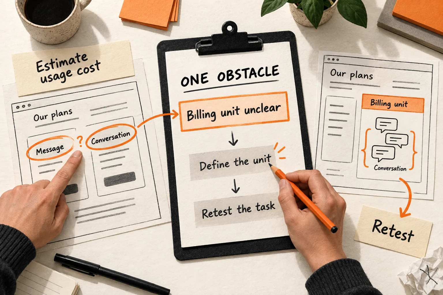
In five separate usability sessions, three participants cannot determine whether usage is billed per conversation or per message. Two pause before signup to look for an explanation. These observations suggest a question worth fixing, but they do not establish that 60% of visitors have the problem.
The team could record this entry:
| Field | Hypothetical entry |
|---|---|
| Obstacle | Buyers cannot estimate usage charges before starting a trial. |
| Evidence | Three of five participants could not identify the billing unit. The pricing page uses both terms without explaining their relationship. |
| Funnel context | 24 of 120 users created accounts within seven days of opening signup. The connection to billing uncertainty is unproven. |
| Severity and reach | The ambiguity prevents a cost estimate. The share of visitors affected is unknown. |
| Confidence | The terminology problem is supported by the page and observed tasks; its effect on signup completion remains uncertain. |
| Proposed correction and effort | Confirm the billing rule with the product owner, then define the unit and add one accurate usage calculation beside the plan details. |
| Priority rationale | Address the supported information gap before changing illustrations or layout based only on preference. |
| Validation | Repeat the estimation task with new participants. Track signup completion and the first useful product task under unchanged measurement definitions. |
This gives a designer and writer a specific problem to solve while leaving room for other explanations of the funnel loss.
Validate the correction before expanding the redesign
Make the smallest change that addresses the supported explanation. That might be a pricing example, a visible integration requirement, a clearer error message, or a navigation change.
Repeat the task with new participants to see whether they can complete it without assistance. This checks usability. Measuring a conversion effect requires a separate plan.
Before running an experiment, define the primary outcome, minimum effect worth acting on, required sample size, and stopping rule. Use those requirements to decide whether you have enough eligible traffic. With sparse traffic, treat a before-and-after comparison as directional evidence: changes in audience, campaigns, and timing remain possible explanations.
A larger redesign may be justified when the same problems recur across templates or the current structure prevents workable fixes. Carry the observed tasks into its acceptance criteria.
Complete one obstacle worksheet before the next design review
Copy this template and fill it with one observed problem. Mark missing evidence as unknown.
Audience and attempted task:
Page, version, and unresolved buyer question:
Observed behavior and evidence reference:
Participant count and assistance given:
Funnel step and event triggers:
Date range, counting unit, denominator, and conversion window:
Tracking checks and known gaps:
Suspected explanation and plausible alternatives:
Severity:
Reach, including what remains unknown:
Confidence:
Smallest correction, effort, and dependencies:
Priority and reason:
Owner and review date:
Usability check:
Business outcome and downstream quality check:
Evidence that would change the decision:
Bring the completed entry to the redesign discussion. Agree on the obstacle to address, assign an owner, and decide what evidence would show that the correction worked.