A buyer checks your comparison page to see whether a plan includes CSV export. A green checkmark says yes, but leaves out the plan restrictions, exported fields, and date anyone checked.
Build an accessible comparison table with explicit headers, answers in text, and evidence attached to the claims it supports. Keep conditions visible in the cells, then test whether a reader can use the table to make the intended decision.
Choose the decision before choosing the rows
Start with one sentence: “This table helps [reader] choose between [options] for [task] under [constraints].”
For a small SaaS team, that might mean choosing a support tool that requires an agent to approve an AI reply before it reaches a customer. Approval controls, supported inboxes, and conversation exports could matter to that decision. Unrelated features would add reading without helping the team choose.
Use questions from customer interviews, support conversations, or relevant public discussions to propose criteria. Keep each original question and its source separate from your interpretation. One person’s objection can justify investigating a row; it doesn’t establish that every buyer shares the concern.
Make row labels specific enough to check. Replace “AI capabilities” with “Agent approval before sending.” Split “Data portability” into export format and export scope if both affect the decision.
If you still need to define the audience and use case for the whole page, use the SaaS comparison page outline. The steps below focus on the table and its evidence.
Give each cell an evidence record
Use the same evidence standard for your product and alternatives. Vendor documentation establishes what the vendor says a feature supports. A test establishes what happened under the conditions you tested. Label the evidence type so readers can distinguish those claims.
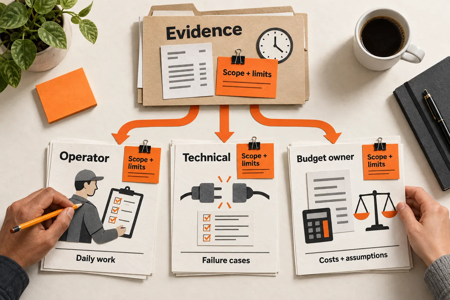
For each substantive cell, record the option and exact plan, proposed wording, supporting URL and passage or test procedure, checked date, and any condition that changes the answer. The worksheet below collects these details.
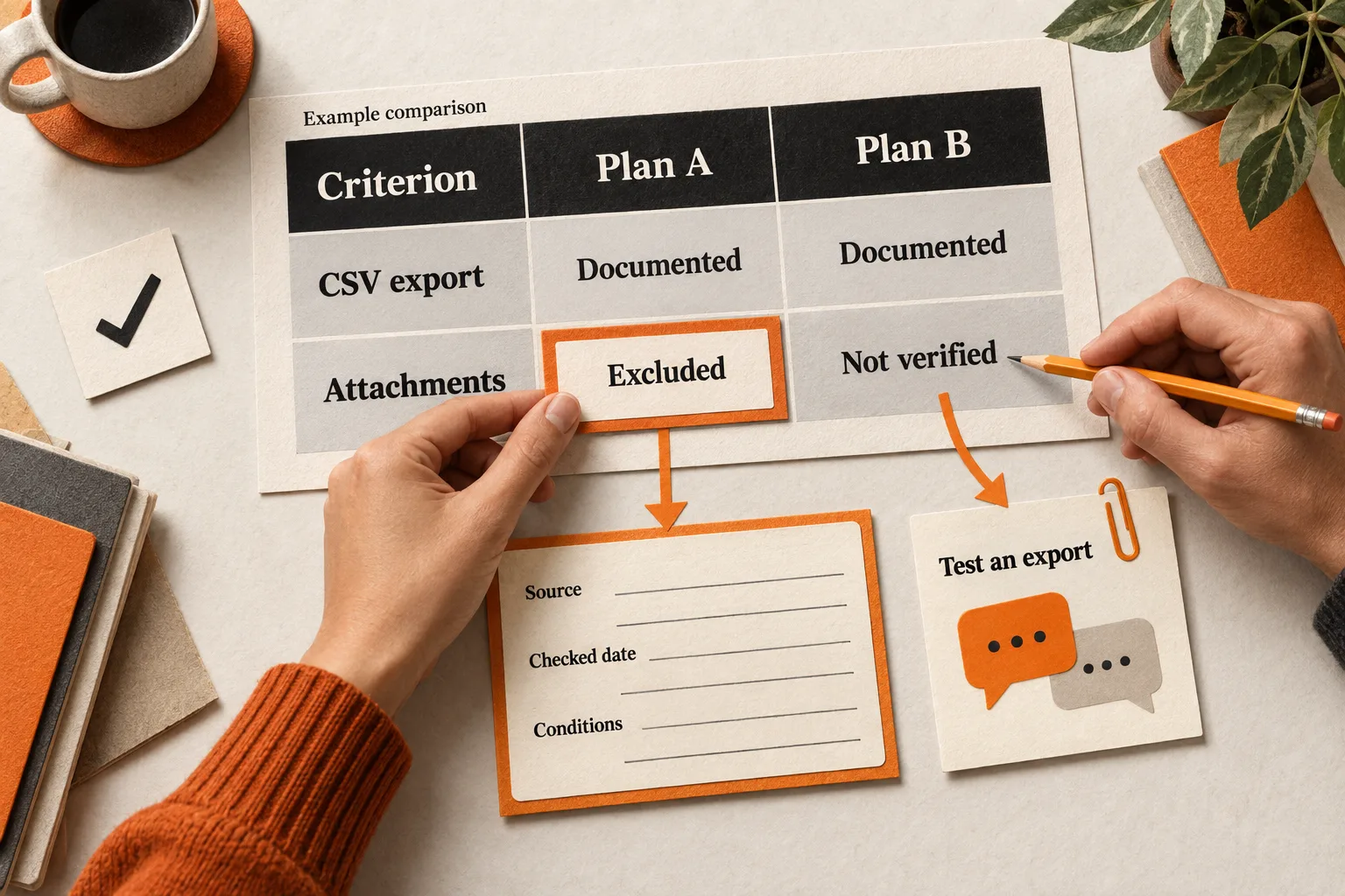
Use “Not verified” when evidence is missing. Write “Not included on this plan” only when a source supports that conclusion. An empty cell leaves readers guessing whether the feature is absent, unknown, or irrelevant.
Put decisive limits inside the cell. “Available on Enterprise” gives the reader more information than “Yes” with a distant footnote. Link to the supporting source from the cell or a clearly labeled evidence note immediately below the table. Use descriptive link text, such as “Tool A export field documentation.”
Show the checked date with the claim or its evidence note. Use a single table-wide date only if it accurately covers every claim. A checked date records when you inspected the evidence; it doesn’t prove the feature remains unchanged. Assign someone to revisit pricing, plan eligibility, and usage limits, and refresh dates only after checking again.
Specify semantic HTML in the publishing handoff
A grid can look correct while leaving a screen reader without the relationships needed to interpret it. W3C explains that accessible tables identify header and data cells in markup. Visual formatting alone is insufficient. W3C Tables Tutorial
For a simple comparison, ask your developer or CMS editor for a native HTML table with:
- A descriptive
captionidentifying the comparison. - Column headers, including option names, marked as
thwithscope="col". - Criteria marked as
thwithscope="row". - Answers marked as
td.
W3C’s example demonstrates these header associations and explains how captions help screen reader users identify tables. Tables with two headers
A caption might read “Support reply controls: Team plans.” Explain the intended buyer and exclusions nearby, and attach actual checked dates to the evidence.
Prefer a simple header row and a single column of criteria. If grouped plans, billing periods, and nested categories make the table difficult to follow, split it into smaller comparisons. Complex tables can be accessible, but their header associations require more care.
Treat a Markdown table as an editorial starting point. Inspect the HTML your CMS produces; the Markdown source alone doesn’t establish that row headers or a caption exist.
Work through a hypothetical comparison
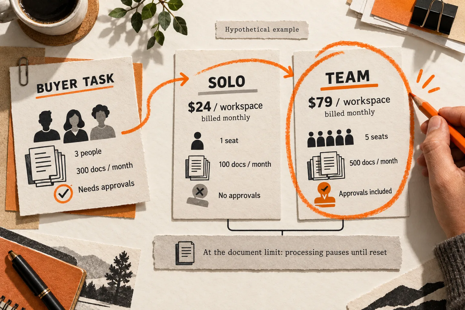
Suppose a three-person support team requires approval before AI replies reach customers. It also wants to export conversations when changing tools.
The products, capabilities, and documentation below are fictional. This example demonstrates cell wording and evidence limits, not actual product findings.
| Criterion | Tool A: Team | Tool B: Team |
|---|---|---|
| Approval before send | Required according to documentation; not tested | Optional setting; enforcement not verified |
| Export format | CSV according to documentation | CSV according to documentation |
| Attachments in export | Excluded according to documentation | Not verified |
Specify the caption “Hypothetical comparison for a team requiring reply approval” and designate the first column as row headers in the implemented table.
In this scenario, Tool A’s documentation says an agent must approve a draft, but no behavior test has been performed. Tool B’s settings guide describes an optional approval step without establishing whether an administrator can prevent agents from disabling it. Tool A’s export guide excludes attachments; Tool B’s guide lists CSV without explaining attachment support.
Tool A’s documented approval requirement matches the team’s constraint. Tool B needs another check before the team can rely on that control. Neither CSV entry establishes that a complete migration is possible.
For a real comparison, attach direct documentation links and actual checked dates to these notes. Keep the unresolved conditions in the cells even when fuller explanations appear below. The next verification task is to test approval enforcement and export a sample conversation with an attachment.
Keep the table usable on a small screen
Limit the comparison to the options and criteria needed for the decision. Keep qualifications brief inside cells and put detailed evidence immediately below.
Test at a width equivalent to 320 CSS pixels and with browser zoom. W3C’s reflow guidance allows an exception for tables that need two-dimensional layout, but individual cells and surrounding text still have reflow requirements. The table can scroll within its own container while nearby paragraphs fit the viewport. W3C guidance on reflow
If horizontal scrolling is necessary, check that keyboard users can reach and operate the scrolling area and then move out of it. Make the availability of more columns apparent. Preserve readable text instead of shrinking the entire grid to fit.
Write statuses in words so readers don’t have to interpret red and green cells. If you also offer a comparison graphic, preserve its essential information in text. W3C’s complex-image guidance demonstrates a short image description paired with a detailed text equivalent, which can be adjacent or linked. W3C guidance on complex images
Set a realistic expectation for AI search
Google recommends making important content available in text. Its guidance says AI Overviews and AI Mode require no special optimization or special schema.org markup. Meeting the requirements does not guarantee crawling, indexing, or appearance. Google’s AI features guidance
This supports keeping the comparison available as readable text. It does not establish that tables receive preferential treatment or that dates and sources will earn an AI citation.
The table should help a reader arriving from search, an AI answer, or a teammate’s link understand the scope, inspect the evidence, and identify the next step.
Use this worksheet to finish one comparison
Copy this template for each claim before adding it to the page:
Buyer decision:
Criterion and definition:
Option and exact plan:
Cell wording, including decisive conditions:
Source URL and supporting passage, or test procedure and result:
Evidence type: documented / tested / not verified
Checked date:
Public source link or labeled evidence note:
Unresolved questions:
Owner and next review trigger:
Review the rendered page with these checks:
- Identify the compared plans and intended task. Confirm that each decisive claim has supporting evidence and a checked date, and that unknowns are distinguishable from confirmed exclusions.
- Navigate through the table with a screen reader. Check that the relevant row and column headers provide context for each answer.
- Use the keyboard to reach evidence links and operate any scrolling area. Confirm that you can leave the scrolling area.
- At narrow widths and increased zoom, read the cells, caveats, and surrounding text. Check for clipped or inaccessible information.
Ask someone from the intended audience to answer the buyer question using the table. Have them explain which option they would investigate, why, and what remains unverified. Record where they hesitate or misunderstand a label, along with the page version they used. This can reveal comprehension problems; it cannot establish a general conversion lift or predict AI visibility.
Start with one existing comparison graphic. Rebuild the rows that could change the buyer’s choice, complete their evidence records, and test whether a reader can explain the tradeoff and next verification step.